Lotus Cleaning RebrandingCreating a coherent and conscious visual identity
The new identity was designed to create a clean and consistent look across the entire portfolio, while improving the usability of packaging and creating a more conscious and recognisable brand presence.
Services
Branding
Image design
Packaging design
Marketing strategy
Framework system design
Merch products
Lotus Cleaning Rebranding
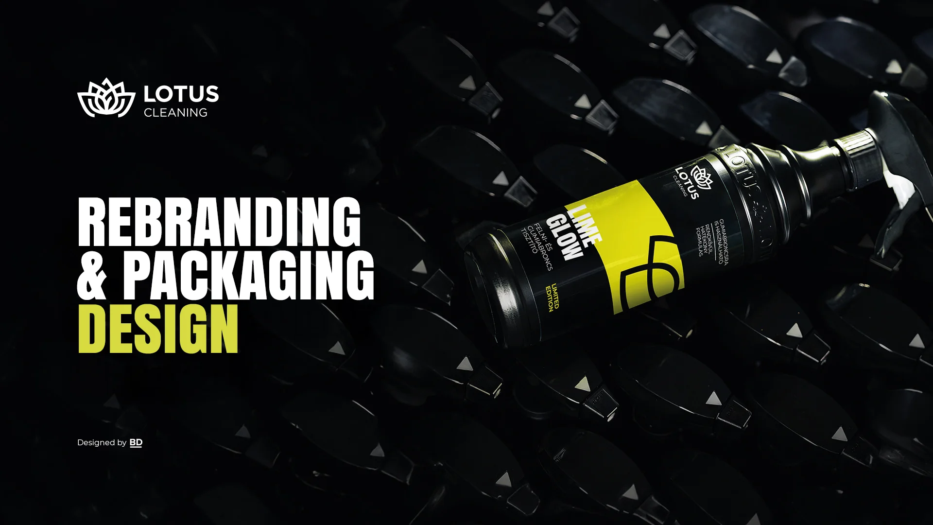
For more than a decade, Lotus Cleaning has been a dominant player in the Hungarian car care market, with a wide product portfolio to meet the needs of the public. However, this strength has also brought challenges: the organically expanding range lacked a coherent visual framework, resulting in inconsistent packaging and difficulties in integrating new products. A strategic repositioning became essential, focusing on the development of a coherent and conscious visual identity.
The goal of the new visual identity was to ensure a clean and consistent look across the entire portfolio, while improving the usability of the packaging and creating a more distinctive, easily recognizable brand presence. We removed all illustrative visual elements, retained the color-coding system, and introduced a more distinctive typographic approach with greater contrast. The claims elements were given a more prominent role, and the product names appear primarily in English and secondarily in Hungarian, in preparation for international expansion. The complete elimination of the color gold further reinforced the clarity and consistency of the new visual direction.