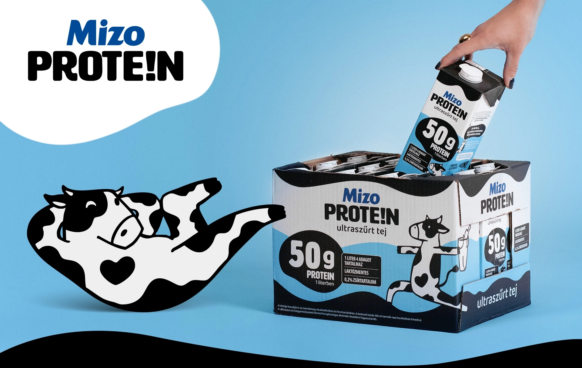
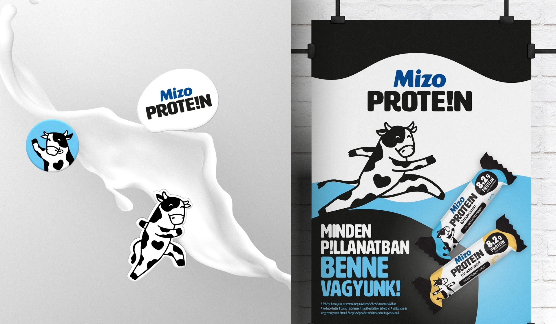
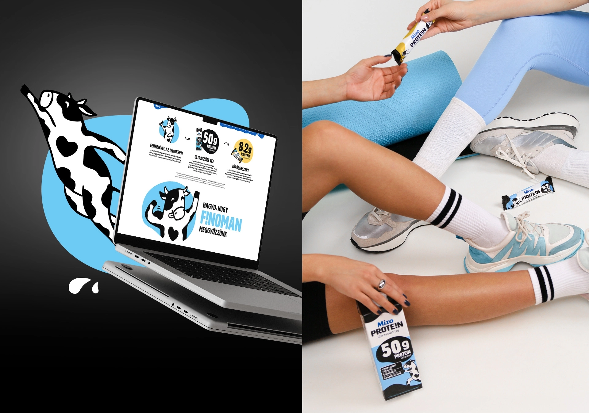
We won the tender to design the packaging for the Mizo Protein range. The aim was to give the protein-rich products a distinctive visual appearance.
Services
Logo design
Packaging design
Marketing strategy
Brand strategy
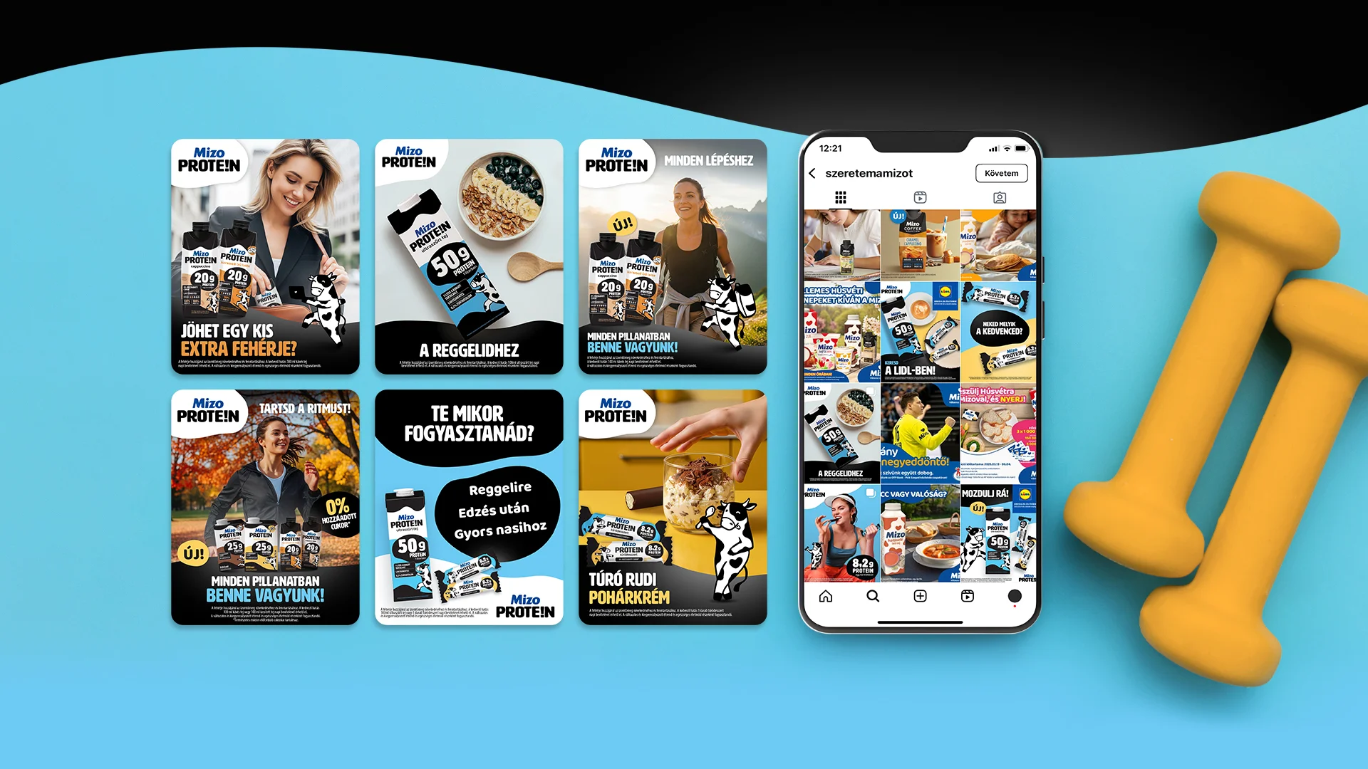
Social content production
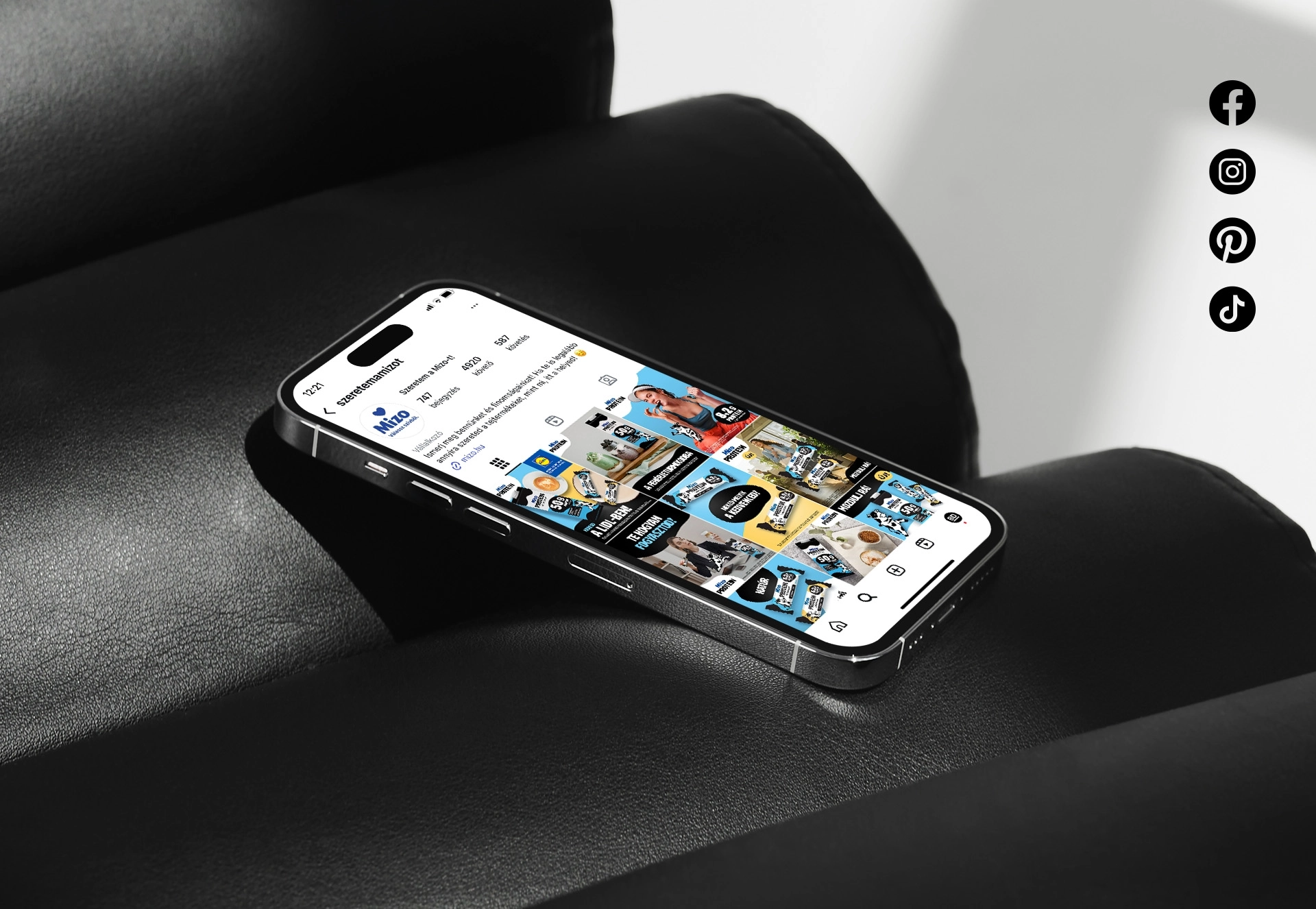
Digital campaign
Illustrations from
Play Video
Mizo PROTE!N
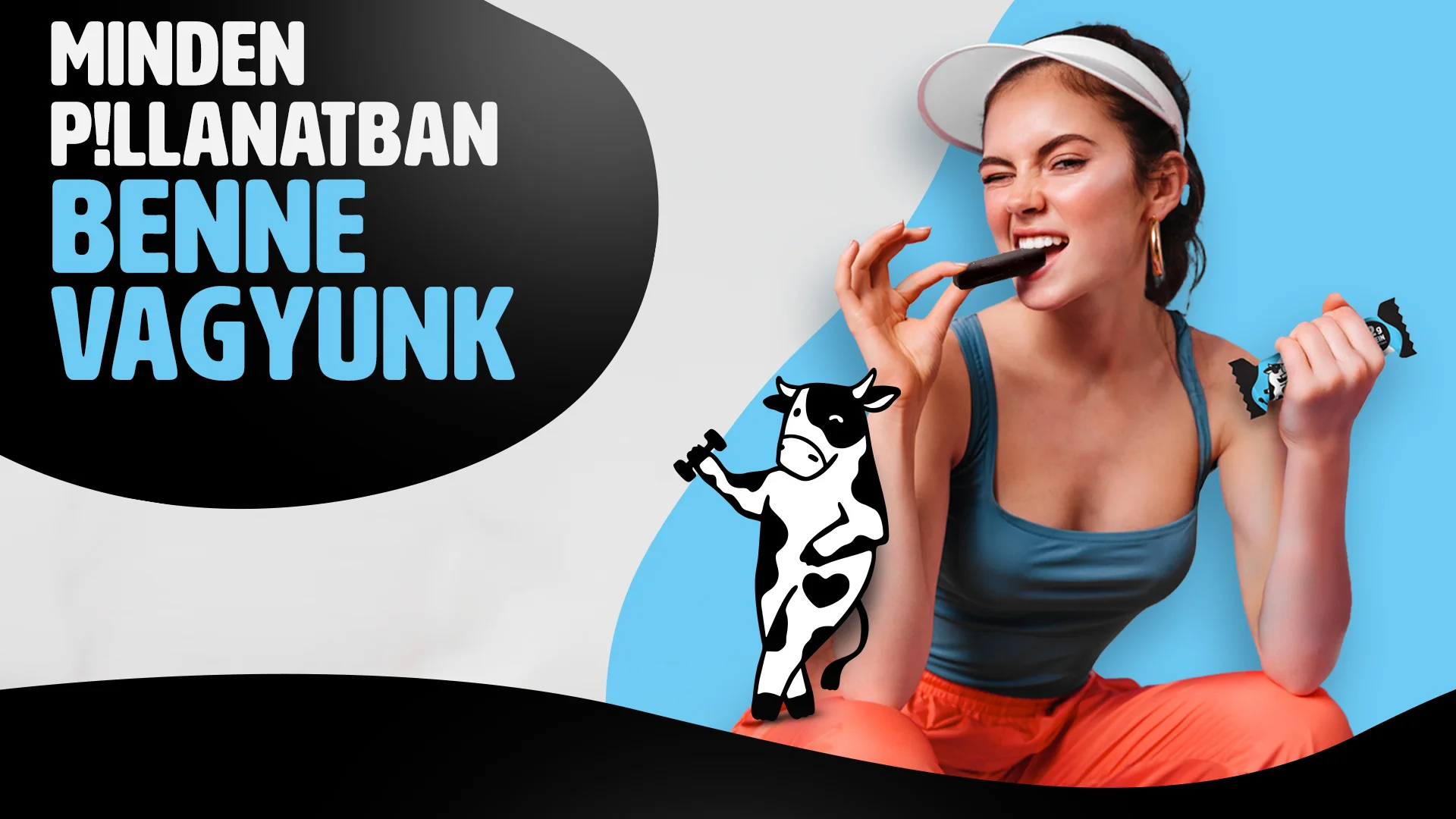
Through target group research and brand positioning, we explored why consumers care about consuming protein products and what kind of visual world can represent this. The brand’s personality traits were compared with those of its competitors and used to develop its own character traits.
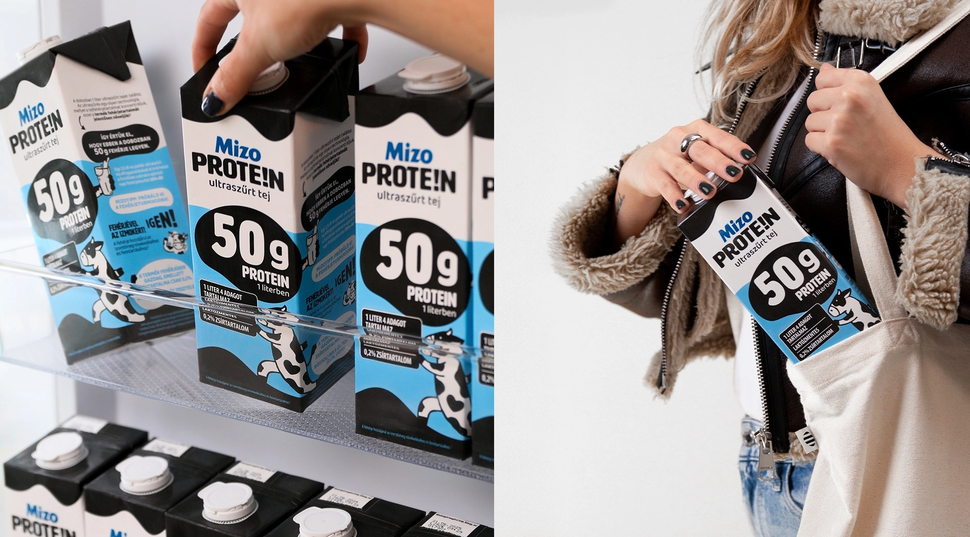
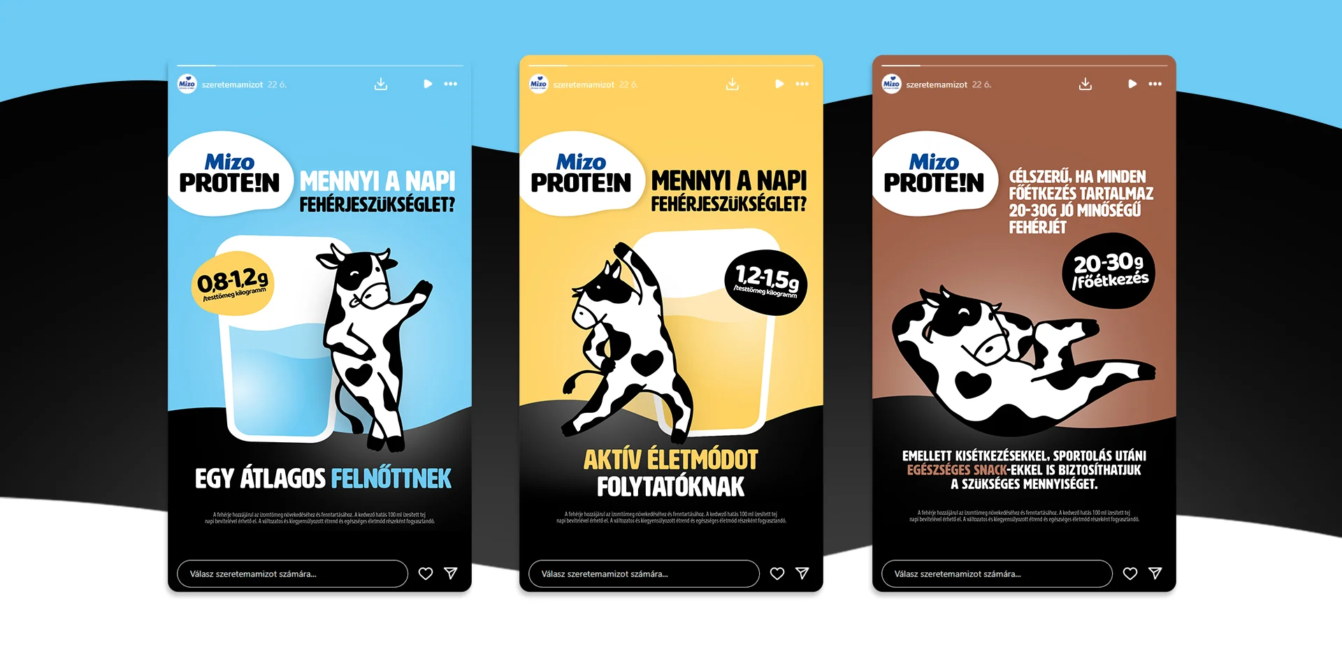
The hierarchy of claims and market semiotics studies have also played an important role in determining the order of the different communication layers of packaging. AI-based vision optimisation was used in the design process to ensure that the final visuals were as appropriate as possible for the fast-paced in-store decision-making environment.
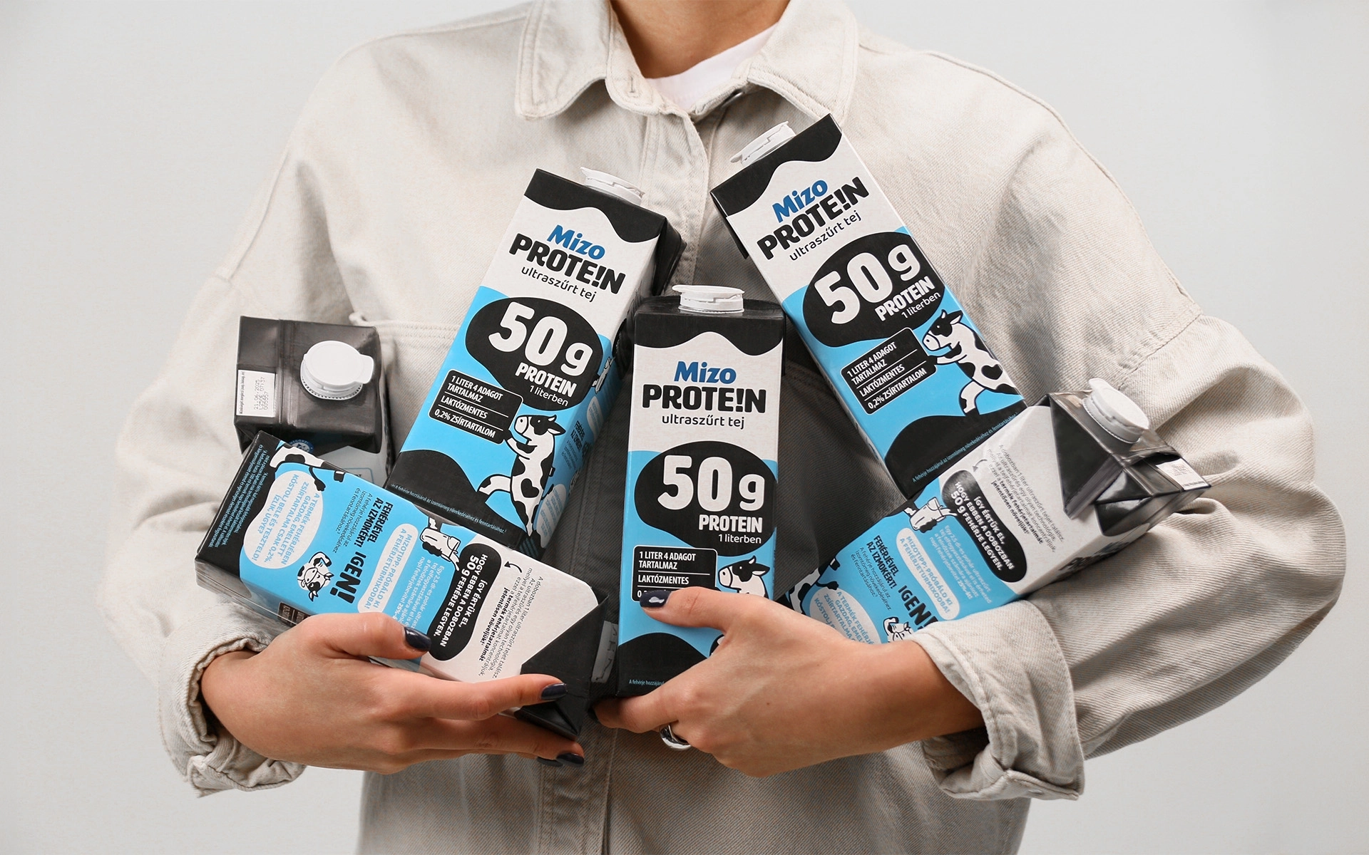
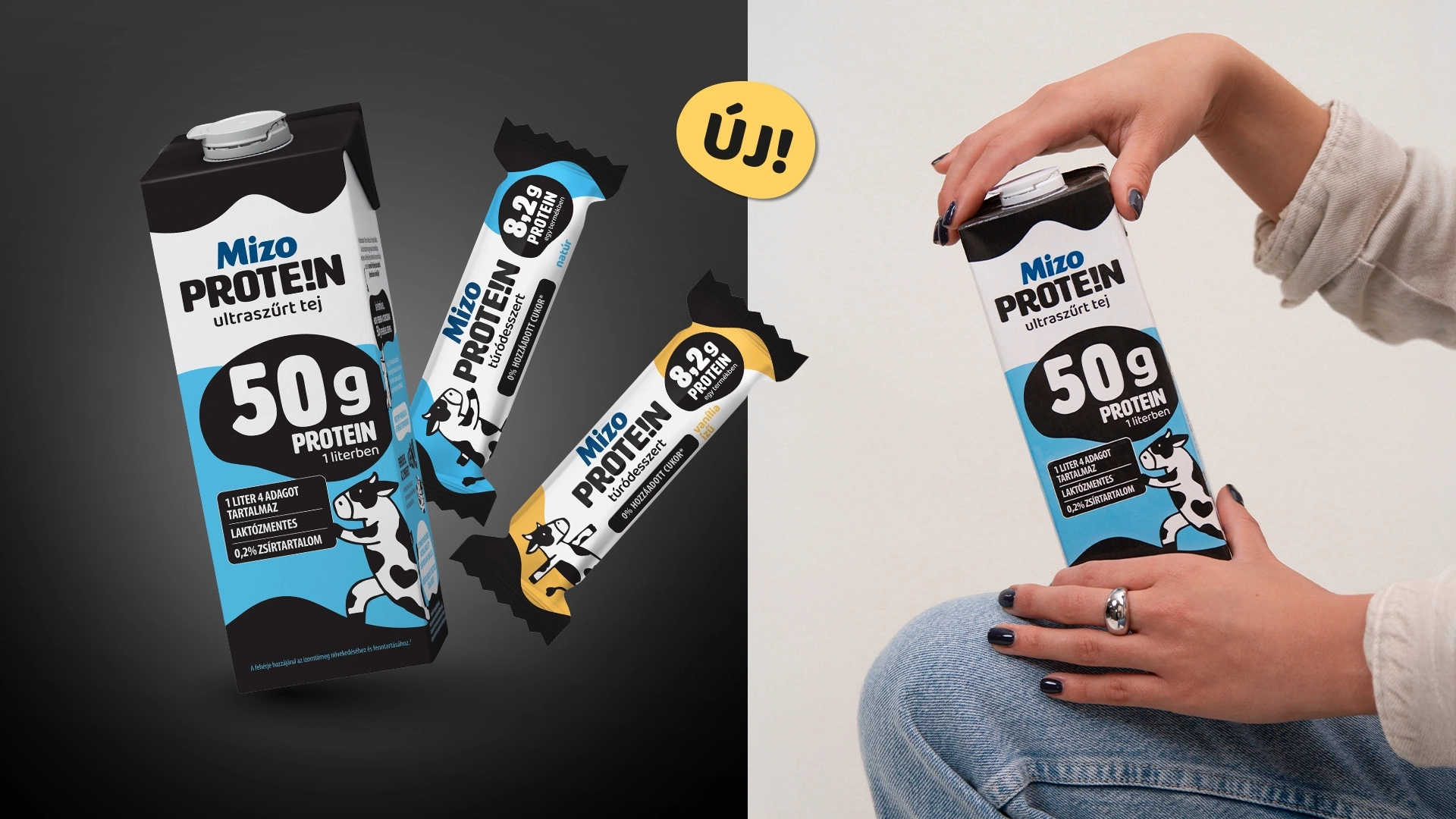
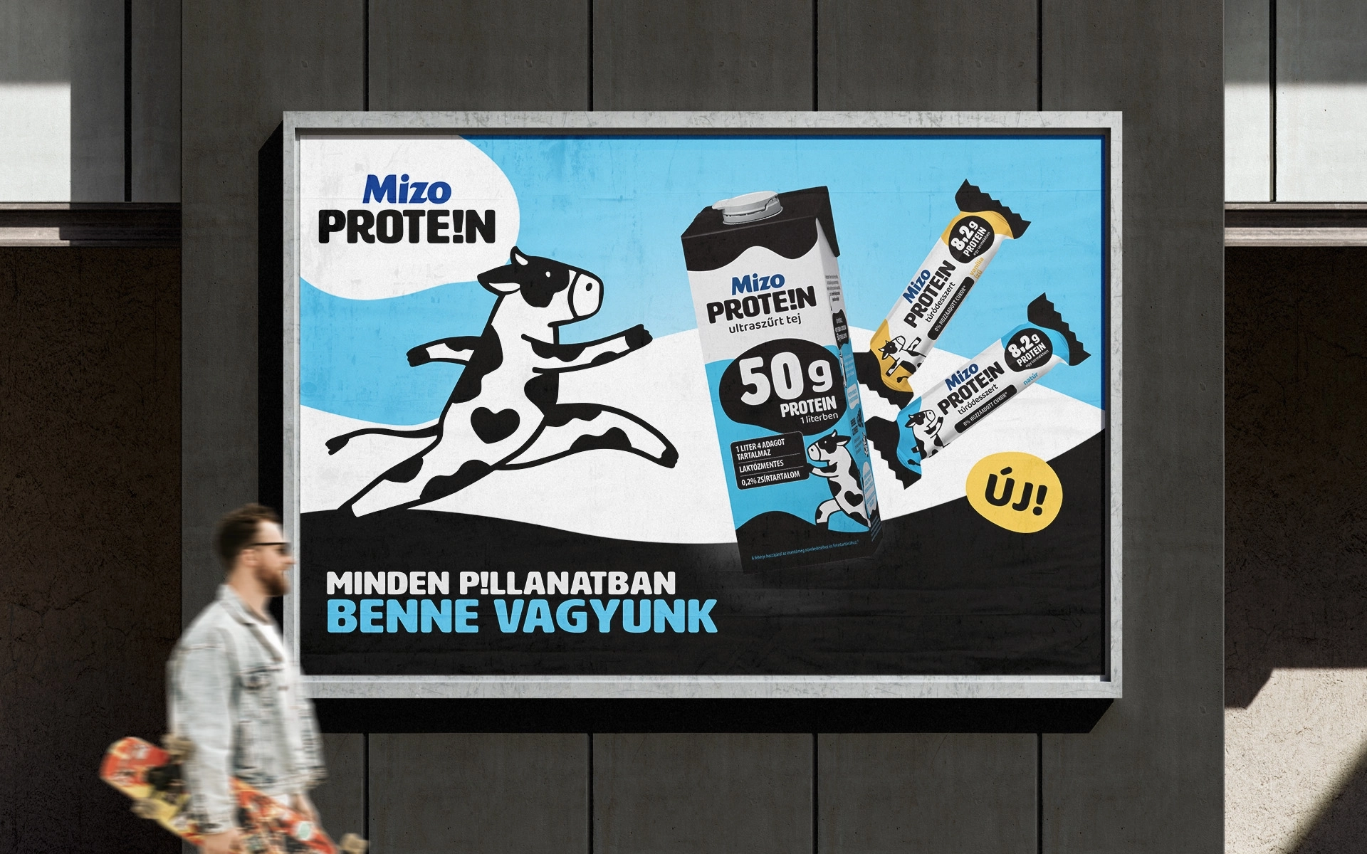
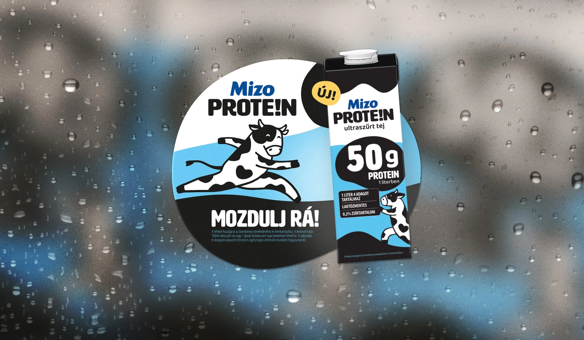
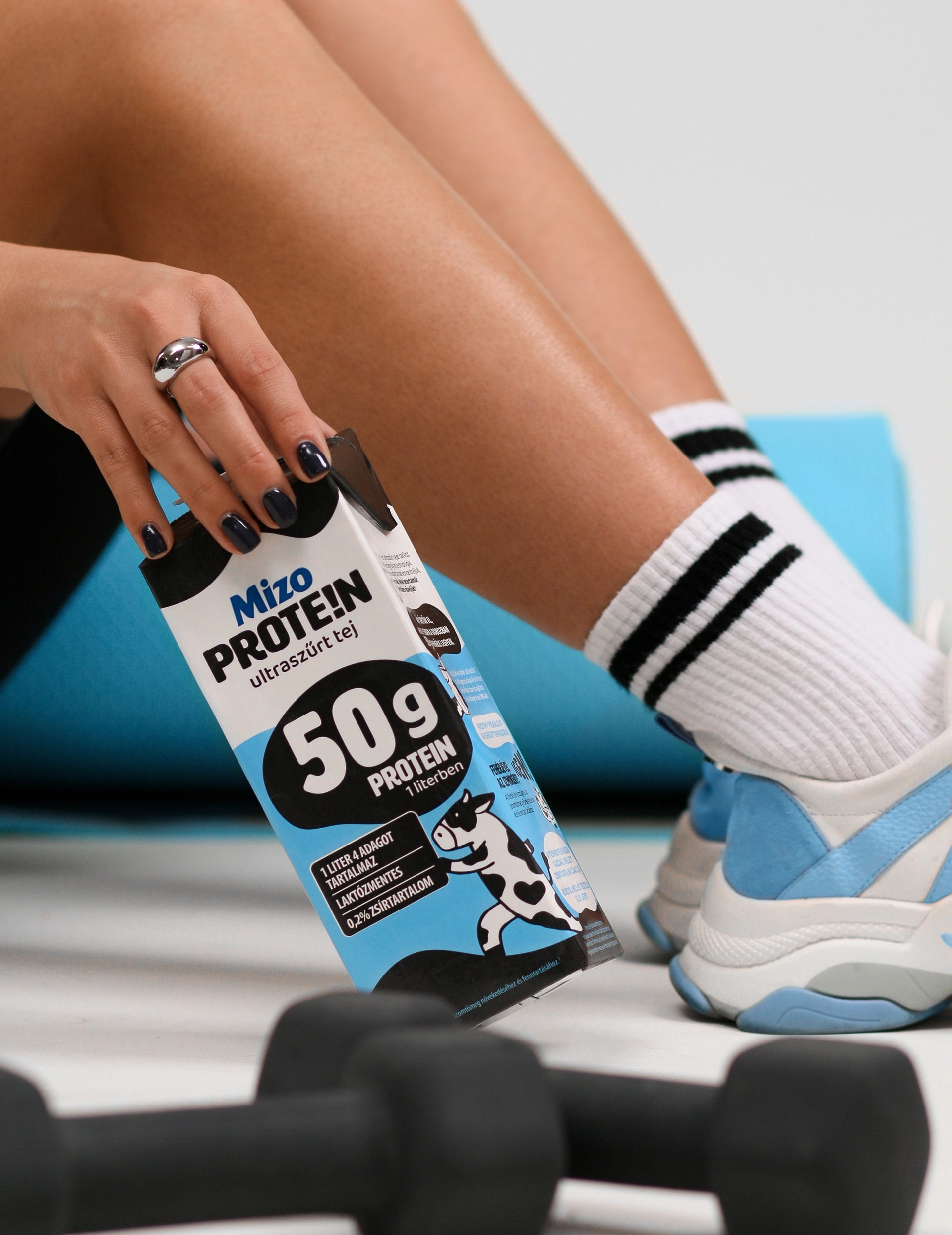
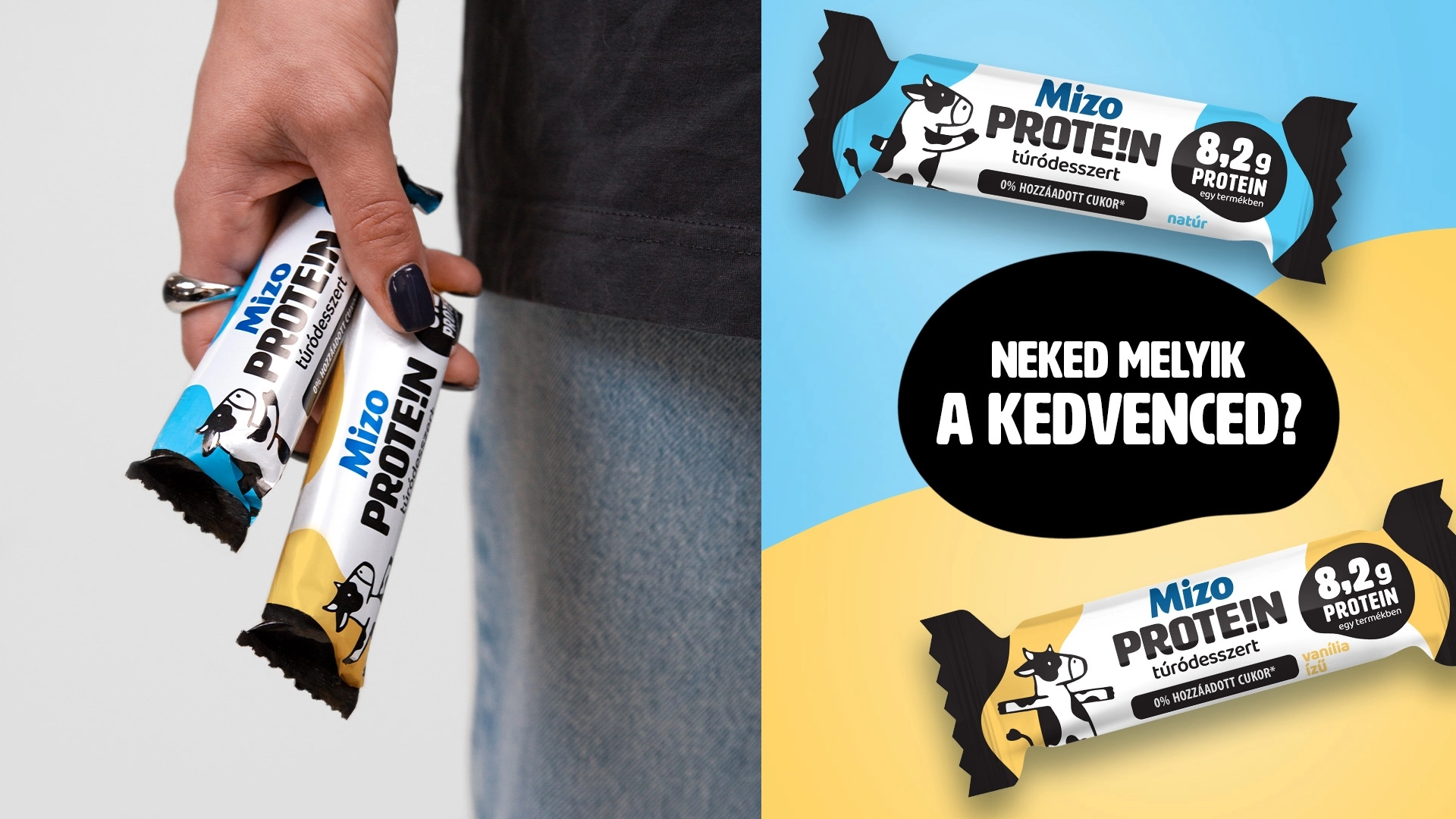
The packaging designs also focus on the role of the side panel – which is not only educational, but also supports branding visually. The first products – Mizo PROTE!N ultra-filtered milk and cottage cheese dessert (natural and vanilla flavours) – hit the shelves in spring 2024.
During the project, we created a packaging that not only visually captures the attention of the target audience, but also represents a clear position in the domestic protein-based products market. Mizo PROTE!N has entered the market as a distinctive, energetic and youthful brand – the result of a modern, strategic packaging design.